
Thursday 1 March 2018
Thursday 15 February 2018
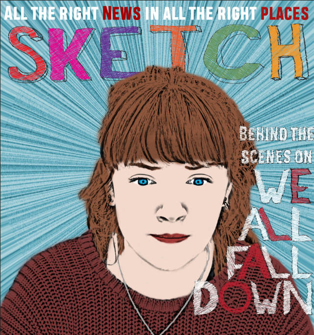
Sketch Magazine
For my magazine, I had a strong idea of what I wanted - a hand-drawn look to the poster, similar to Little White Lies, with everything artificial and brightly coloured. I decided I could probably achieve this in Photoshop, which is good as you may have seen my actual drawing skills from another post.


For the background to the main part of my magazine, I settled on this radial blue design, created in photoshop. I like it because it really draws the eye to the centre of the poster.

I used Illustrator to trace over the film's title and give it the same hand-drawn look - I actually ended up doing this on almost every piece of text on the magazine. I positioned the text so that it fell around her face, in a convention of the magazine.

Putting all that together with a tagline for the magazine at the top, we get the following result, which I think is a great art-house style.

Of course no magazine would be complete without a bar of extra features in the magazine, and mine ended up looking like this with a bar-code and title:


I started by drawing our main actress in the same style as my 'extra features' at the bottom of the magazine, discussed in a previous post. Essentially, this consists of turning her into an outline and then manually colouring her in. I've put two screenshots here to outline the process:


With my main feature's photo finished, I started on the title of the magazine. Having been colouring in for ages, I decided on Sketch Magazine as the name, and this cool hand-drawn style below for the design. I really like what I've done here.

For the background to the main part of my magazine, I settled on this radial blue design, created in photoshop. I like it because it really draws the eye to the centre of the poster.

I used Illustrator to trace over the film's title and give it the same hand-drawn look - I actually ended up doing this on almost every piece of text on the magazine. I positioned the text so that it fell around her face, in a convention of the magazine.

Putting all that together with a tagline for the magazine at the top, we get the following result, which I think is a great art-house style.
Of course no magazine would be complete without a bar of extra features in the magazine, and mine ended up looking like this with a bar-code and title:

The actual creation of extra features is covered in another blog post.
The final poster is below, and I'm very pleased with it.

Thursday 8 February 2018
Third and Final Poster
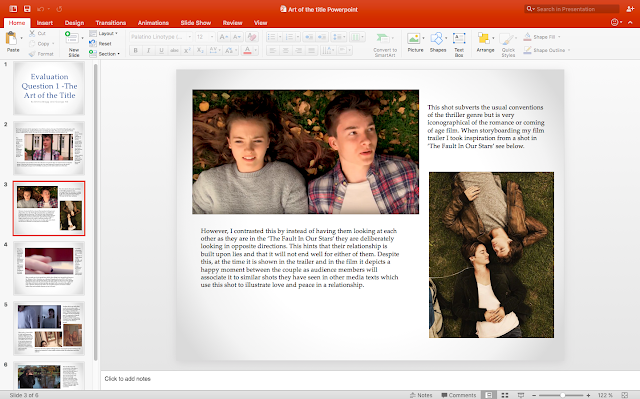
After my previous two posters, I had a much better idea of what I wanted - I wanted a poster to reflect the difference in her behaviour between the start and end of the film. I thought it should reflect her dual nature, and so I decided to go with an image of her against a wall looking at a poster of herself. I thought this was very postmodern and an ambitious idea for a poster. I drew up an initial plan:

As you can see, my drawing skills are abysmal. However, this gave me enough of an idea that the poster would work and I decided to go ahead.
I decided I could adapt one of my previous poster designs to fit this frame - I chose the scarface-inspired one as I felt it reflected the thriller theme. I cropped the poster and adjusted the background to give this:

I added in the title, in the trailer's style. I decided to move the words around and to slant one of them, as I felt this added an extra dimension to the poster.

I then added a billing block, as is traditional in posters, and two reviews. I didn't spend too much time on these, as I knew they would end up being fairly small on the final poster, so they are just fairly simple stars and the name of the institution. Here is the final result, which I'm quite pleased with:

Now for the main poster, I wanted an image that was nothing like what was in our film, but reflected a few themes. For this I brought our actress to a brick wall - a theme which we saw a few times in our trailer, but this was an entirely different wall. I couldn't find any stretch of wall with nothing else on it, so I settled for this photo:

I initially liked the low angle, but later decided the wall should be flatter to camera, as the perspective was otherwise off. There was also some noticeable barrel distortion due to the wide-angle lens I was using, and I knew I could fix all this in post. After much effort, I straightened up the picture, corrected the distortion, and removed the parts of the background that aren't wall:

I then added a Curves adjustment to increase the contrast and make the photo look a bit better:

I then found a picture of a poster on a wall, and just cut out the frame. I liked this frame because it was simple and would blend in reasonably easily with my background.

I then placed the poster from earlier. I flipped the frame round so it would be more consistent with the scene's lighting, and added a gradient to the poster to the same effect. It's not perfect but it's good enough for this application.

The wall was looking pretty bare so I added some text around the actress - in a similar style to the Lion Oscars poster. I also created a displacement map for the wall so it would look like the text was actually on the wall rather than just sitting on top of it - The final result is something I'm very pleased with.

This was an ambitious design, and I'm not sure it's quite worked - in my opinion, the main thing off with it is the lack of matching colour schemes between the wall's poster and the main event. Perhaps a red wall or red text would have done it justice, but in the end I couldn't quite pull it all together. Next time I would work harder at this.
Saturday 20 January 2018
How did you use digital technologies in the construction and research, planning, and evaluation stages?
Software
Blogger
In my opinion, blogger is the main limiting factor when it comes to digital technology. The interface for creating posts is clunky and slow, and the WYSIWYG editor is hugely inaccurate when handling multimedia content. Despite this, I used it to present the majority of my coursework. I did this because it is reasonably convenient and easy to navigate for the reader.Google G Suite


Google Docs
Google Docs is useful (again) for two people accessing the file concurrently - it allowed both me and my partner to edit documents simultaneously. This allowed for significantly more straightforward collaboration, a feature that isn't currently offered with competing products such as Microsoft Word.Google Sheets
Google Slides
SurveyMonkey

We used survey monkey for collecting audience feedback data - this was useful for shaping our product as we went. Both before and after producing our media product we took audience surveys using SurveyMonkey.
Celtx
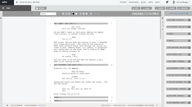
Celtx is an online collaborative script, shot list, and props and location breakdown editor that we used for our trailer. Celtx allowed a professional-looking document at little to no cost - however, we ran into a problem at the end of our usage of the software. We didn't realise, but we had run out of a free trial. Thankfully we had already downloaded the necessary documents so did not lose any time or resources.
Incompetech
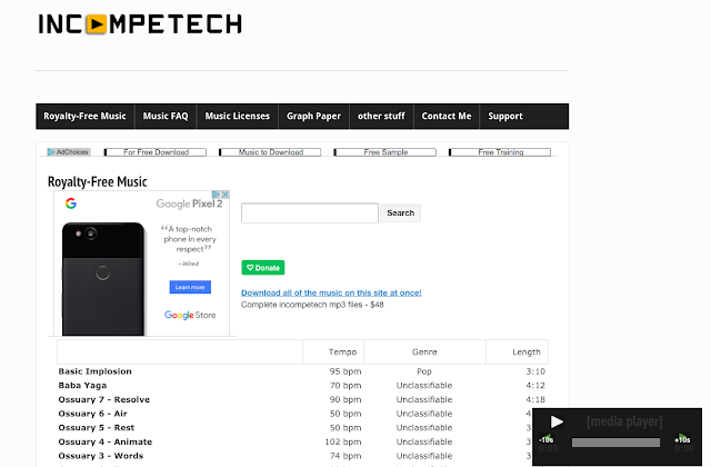
I used incompetech.com to get trial music for use in drafts of the trailer - they have a very large variety of completely royalty free music free of charge organised by genre, feel, length, instrumentation, tempo, and mood. I also made use of the YouTube Audio Library for royalty-free sound effects for the same purposes. You can hear some of these in earlier drafts!
Dafont

Dafont.com is where I found inspiration for the fonts I created throughout A2. I would find a font I liked, attempt to copy the style in Illustrator using a graphics tablet, and edit the style to my liking. My partner also used fonts from Dafont.com for some of the intertitle fonts seen in our trailer. We created brand cohesion using fonts from dafont.com from last year (True Lies) to show that it was from the same production team, as stated in the intertitle.
YouTube
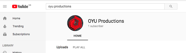
YouTube is how we shared our videos, a single place to post rough cuts, final films, animatic and director's commentary. We created our own channel, OYU productions, to appear more professional in our distributive attitude. We used YouTube comments to gather feedback on our rough cuts and final film, which fed back in to the future cuts of the media product.
Premiere
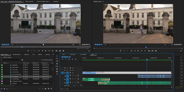
Premiere was the editing powerhouse of this project - it's where the whole thing was built and assembled from the ground up. With the exception of a few shots, all of our editing was done in this comprehensive non-linear editor. At AS we used Final Cut Pro but I expressed my discontent with this at the time and as a result, this year I was allowed to use Premiere Pro. It is by far my favourite NLE. Sequences are insanely useful and the ability to link with other Adobe products, such as After Effects, makes it incredibly easy to collaborate and work across an entire suite of products as the Creative Cloud suite is designed to do. Premiere provides a large amount of creativity as regards colour correction - while Lumetri and the three-wheel colour correction workflow can take some getting used to, they've allowed me to achieve a look I really liked. This is often a problem for me; I rarely like my own end products so Premiere has given me the freedom I desire in this regard.
Garageband
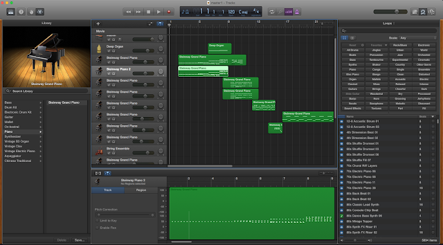
Composing the score for the trailer was a breeze thanks to Apple's semi-pro MIDI editor Garageband. It allowed me to import exported footage from Premiere (sadly no Adobe integration - however, Garageband is part of the much-less-better-integrated Apple Pro suite of applications, of which my oft-objected-to arch-nemesis Final Cut Pro is a member) and synchronise with music directly, once the master edit was completed.
Illustrator
Adobe Illustrator is, without a doubt, my favourite new application off the back of this coursework. It allowed me easy integration with the graphics pen I used (as does the rest of the Adobe suite, for that matter - another pro against Apple's). I used it primarily for creating and editing fonts for use in the trailer, which I didn't feel I was able to last year. I also used Illustrator to create the 'scribble' effect used on my magazine cover, which would have been immensely difficult otherwise, as Illustrator allowed me to trace over text and easily colour it in by hand as seen.
After Effects

Adobe's After Effects remains one of those programs that is indispensable for random, unforeseen tasks. For example creating titles - the (relatively) easy key-framing of literally any property of any object in a scene makes it easy to make titles do what you want them to do. I used it to create both idents at the start of my trailer and to correct part-by-part some scenes that required heavy colour correction or emphasis not easily achievable in another program. You can also see in the screen capture above an attempt at some super-imposition of cracks onto her face, however this proved too difficult for me to do in the time given.
Photoshop

Adobe Photoshop was used principally for my magazine and poster assembly, as it was easiest in this program to move and rescale things, as well as nest image compositions within each other to increase ease of editing.
Prezi
I used Prezi for data presentation in my evaluations, as it is a fun and engaging format not often seen in presentations. It is easy-to-use for the reader but provides a rare format. Prezi's can take a while to make due to the occasionally clunky or nonsensical creation interface, but the payoff is well worth the effort as it enables me to zoom around looking specifically at parts of images that I want to draw to the reader's attention.
Hardware
Cameras
80D
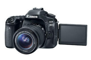
The Canon EOS 80D is an APS-C crop-sensor camera. We chose it because we felt it would offer greater freedom over especially depth-of-field and exposure. The interchangeable-lens camera, while not a huge upgrade over the G25 below which we used last year, offered us a range of options to choose from in lenses.
G25

The Canon LEGRIA HF G25 prosumer (in this case standing for professional-grade consumer, meaning high-end) fixed-lens 1/3" sensor camera is an excellent choice for any budget production. I just happened to have one, and I knew already how to use it, so it made sense to use in parts of this production where it was more convenient than another option.
iPhone SE
The iPhone SE, while an unconventional choice for camera, offered a greater flexibility in frame-rates and positioning. We used it only for a few shots where slow-motion or very difficult-to-reach places were required, and only one of these shots made it into the film.
Sound
Tascam DR-07 mk II
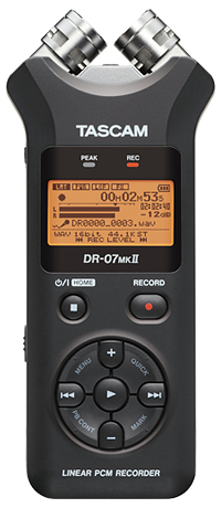
This DAR is a fairly standard budget option for recording sound to an external device. It's bigger brother the DR-40 was also used at one point in the production to record sound effects - the bidirectional microphones made mixing sound in post-production much more engineer-friendly as I had more freedom over how to mix down my channels.
Rode NTG-2

Again a standard, the Rode NTG-2 is a very beginner-friendly microphone. It requires no phantom power (which the DR-07 can't provide anyway) which is useful as it means batteries last longer on all devices. It is a highly directional supercardioid microphone, meaning that it took some skill to position and distance it correctly. However the result is some very crisp and sharp sound that I'm actually quite pleased with. We used it in conjunction with Rode's own boom pole for ease of holding.
AKG Y50
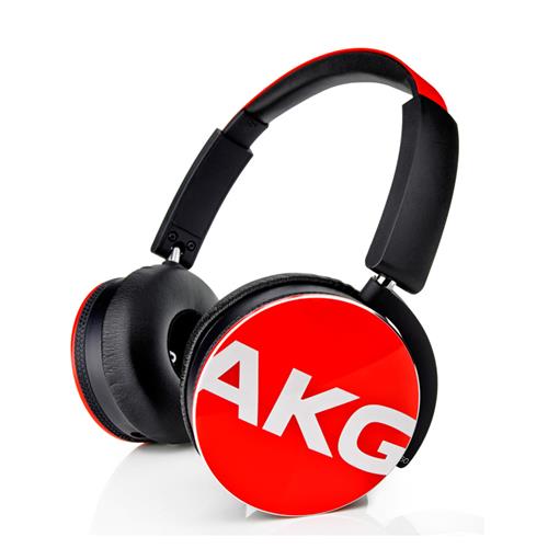
The AKG Y50s were my least favourite part of the sound workflow. The over-ear headphones were a little uncomfortable to wear for long periods (as the over-ear format is famed for) but the closed back makes for as good a studio experience as you can get for the format. The frequency response is far from flat with a raised bass but this just meant I mixed for less bass than I thought there should be, by ear, which turned out pretty well in this case.
Ancillary
Tripods
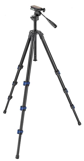
We used a number of different tripods, as each one we used had a different problem - on one there was no spirit level, on another the leg kept falling off, on another there was no fluid pan head. However, we got by using a combination of different tripods, playing it by ear a little and trying to have the correct tripod for the correct shot, and in the worst case adapting our shooting style for the tripod we had. This was less than ideal and in future is definitely something I'd work on.
Friday 19 January 2018
What Have You Learned From Your Audience Feedback?
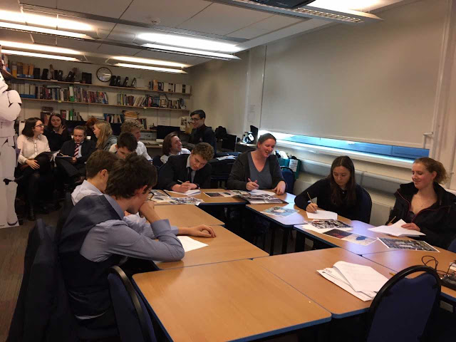
To help us get a good range of audience feedback we decided to host a screening for our film and invited various people, largely choosing to invite people in our age range of 15 - 25 but selecting a few outliers of this as well as it is likely our film will receive some viewers of an older audience.
See below the questionnaire I created to give out to our audience at the screening to find out their opinion on a variety of topics, helping me to find out is if chose the correct target audience and if my audience can detect that the film is marketed towards them. A few of the questions at the bottom asking the audience about their opinion on the connections between our ancillary task and main product I will be using the results of in Evaluation question 2.
Audience Feedback Survey - ‘We All Fall Down’ Trailer - General
Please feel free to leave a comment under any of your answers.
What is your gender?
☐ Male
☐ Female
☐ Other
☐ Prefer not to say
What is your age?
☐ 16-25
☐ 26-35
☐ 36-45
☐ 46-55
☐ 56-65
☐ 65+
Have you seen any of the following psychological thrillers / horrors?
☐ Inception (2010)
☐ The Killing of a Sacred Deer (2017)
☐ Shutter Island (2010)
☐ Taken (2008)
☐ Psycho (1960)
☐ The Shining (1980)
Do you like psychological thrillers / horrors and why?
……………………………………………………………………………………………….
……………………………………………………………………………………………….
……………………………………………………………………………………………….
Watching a trailer in advance to watching a film
Strongly Disagree Strongly Agree
1. Helps me decide 0 1 2 3 4 5 6 7 8 9 10
if I want to see a film
2. Is something I do 0 1 2 3 4 5 6 7 8 9 10
3. Helps me understand 0 1 2 3 4 5 6 7 8 9 10
the plot
4. Gives away too much 0 1 2 3 4 5 6 7 8 9 10
We will now ask you some questions about our trailer
Who do you think the trailer was aimed at?
Age Range: …………. Gender: …………….
What was your favourite part of the trailer?
……………………………………………………………………………………………….
……………………………………………………………………………………………….
……………………………………………………………………………………………….
……………………………………………………………………………………………….
Is there anything you did not understand in the trailer that needs further clarification and why?
Yes ☐ No ☐
……………………………………………………………………………………………….
……………………………………………………………………………………………….
……………………………………………………………………………………………….
What did you think of the music in the film? For example, I liked the instruments used or I appreciated
the transitions between pieces etc.
the transitions between pieces etc.
……………………………………………………………………………………………….
……………………………………………………………………………………………….
……………………………………………………………………………………………….
……………………………………………………………………………………………….
……………………………………………………………………………………………….
What did you think of the ending?
……………………………………………………………………………………………….
……………………………………………………………………………………………….
……………………………………………………………………………………………….
……………………………………………………………………………………………….
……………………………………………………………………………………………….
Would you want to see the rest of the film and why?
Yes ☐ No ☐
……………………………………………………………………………………………….
……………………………………………………………………………………………….
……………………………………………………………………………………………….
……………………………………………………………………………………………….
……………………………………………………………………………………………….
We will now ask you some questions about our poster and magazine front cover
Do you like Emma’s poster and magazine and why?
Yes ☐ No ☐
……………………………………………………………………………………………….
……………………………………………………………………………………………….
Do you like George’s poster and magazine and why?
Yes ☐ No ☐
……………………………………………………………………………………………….
……………………………………………………………………………………………….
Can you see connections between Emma’s magazine and poster with the trailer, and what are they?
Yes ☐ No ☐
……………………………………………………………………………………………….
……………………………………………………………………………………………….
……………………………………………………………………………………………….
……………………………………………………………………………………………….
Can you see connections between George’s magazine and poster with the trailer, and what are they?
Yes ☐ No ☐
……………………………………………………………………………………………….
……………………………………………………………………………………………….
……………………………………………………………………………………………….
……………………………………………………………………………………………….
Here is a photo of the screening taking place, we first showed our trailer and the gave out several printed copies of our posters and magazine front covers to audience members for them to have a look at.
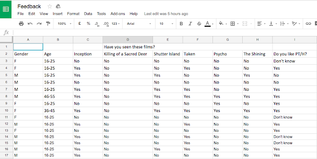
I then took the results of all of the questionnaires and typed them up in Excel where I collated the results. see below all of the raw data.
To make the results more user friendly and to help me write up what I had found I decided to create graphs to graphically display the data for each question.


In the above two graphs it can be seen that we managed to get people to attend our screening who fit well in to our target audience which was the age bracket 16 - 25 and either gender as we felt these were the people who are most likely to attend psychological thrillers. It was important to us that these were the sort of people who attended our screening so we could find out if our film would be apealing to its designed audience.


Only 13.3% of our audience said they did not like psychological thriller/ horrors which left us with the large majority of the audience being a fan of the genre. One of the audience members said they "love twists in movies especially if they aren't obvious" which fits well with our trailer and there is a seemingly twist in the change in personality in Eve

Here we used a Likert scale to get an insight in to our target audience's opinions on trailers as in institution. When creating our scale we deliberately scaled it from 0 to 10 to ensure there was no middle, neutral value audience members could select, forcing them to have an opinion either way. For the first two, 'helping me decide to see a film' and 'is something I do' we had hugely positive results with no one choosing less than 6 for trailers helping them decide if they want to see a film. For 'is something I do' we had similar feedback with no one choosing less than 4 and a large number of people selecting 10, which is very beneficial to us as it means our product will be os use to our target audience. For 'helps me understand the plot' the feedback was slightly lower than we would have liked with no one putting higher than an 8 and a couple of 2 results however the fact that the target audience would still like to watch the trailer over rides this I feel. For 'gives too much away' the results were very high which we expected which is why we intentionally attempted to keep an air of mystery in our trailer where possible without making it boring, we achieved this by revealing very little about what was wrong with Eve and the previous issues that had occurred in her family and left these to be revealed in the full film.
Now we showed them our trailer and asked the audience questions based on it


These results in the above two graphs were very helpful as they illustrated that the large majority of the target audience could correctly identify that the trailer was aimed towards their age range. 13.3% of people speared to believe the film was targeted at females which helps tell us that we have correctly subverted the usual thriller film as it can be seen as a very male genre by some people yet 0% of people said are film was targeted at males and the other 87.6% of people gave us the response that we wanted that our trailer could be targeted at any gender.

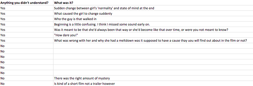
It's pleasing to see the majority of people did not need further clarification of anything. Most of the people who did need further explanation were confused as to what happened to the girl and we had made the conscious decision not to give this away in the trailer as we did not want too much to be revealed so there was no point in going to see the film. Therefore the fact that we left some viewers still wanting answers to questions is actually beneficial to us as they will then want to watch the whole film.


Here we had only one no to wanting to see the rest of the film which is a great success, most people said what drew them to wanting to see the res of the film was the open ending we left which was what we were attempting to do leaving the audience guessing what happens to the mum. The one person who said no said it was because they were not a fan of the genre so would not be inside of our target audience anyway.


In response to my poster and magazine, similar to the film there was only one person who did not respond positively to it and this was the same person who did not want to see the rest of the film and so is likely not within the target audience. Aspects people particularly liked were the fact that the two protagonists were looking in opposite directions on the poster hinting at the imminent breakdown in their relationship. Another aspect commented on was the falling down letters of my title, mirroring the title of the film, also several people mentioned how eye catching the whole appearance of both were which is hugely important in drawing in an audience.


George's poster and magazine again had a very positive response with 73.3% of people responding that they liked them both. However it is clear from the feedback that people preferred the poster to the magazine as they felt it did not fit as well with the thriller genre. The audience commented on how 'ambitious' the poster was, picking up on the ingenuity of it, making it very eye catching.
Subscribe to:
Posts (Atom)